Best Fonts and Typefaces to Use on Billboard Design 2026
When it comes to billboard advertising, your font choice matters more than you think.
Drivers don’t slow down to read your message. Pedestrians glance quickly. Commuters process information in seconds. That means your typography must do one job extremely well:
Be readable instantly.
In 2026, effective billboard design isn’t about trendy fonts; it’s about clarity, contrast, and confidence. Here’s what you need to know about choosing the best fonts and typefaces for billboard advertising.
Why Font Choice Is Critical in Billboard Advertising
Billboards are viewed:
- From long distances
- At high speeds
- In varying lighting conditions
- Often for only 3-5 seconds
If your font is thin, overly decorative, or difficult to read, your message disappears regardless of how good your design is.
The best billboard fonts are:
- Bold
- Clean
- Simple
- High-contrast
- Easy to read from hundreds of feet away
Legibility always wins over aesthetics.
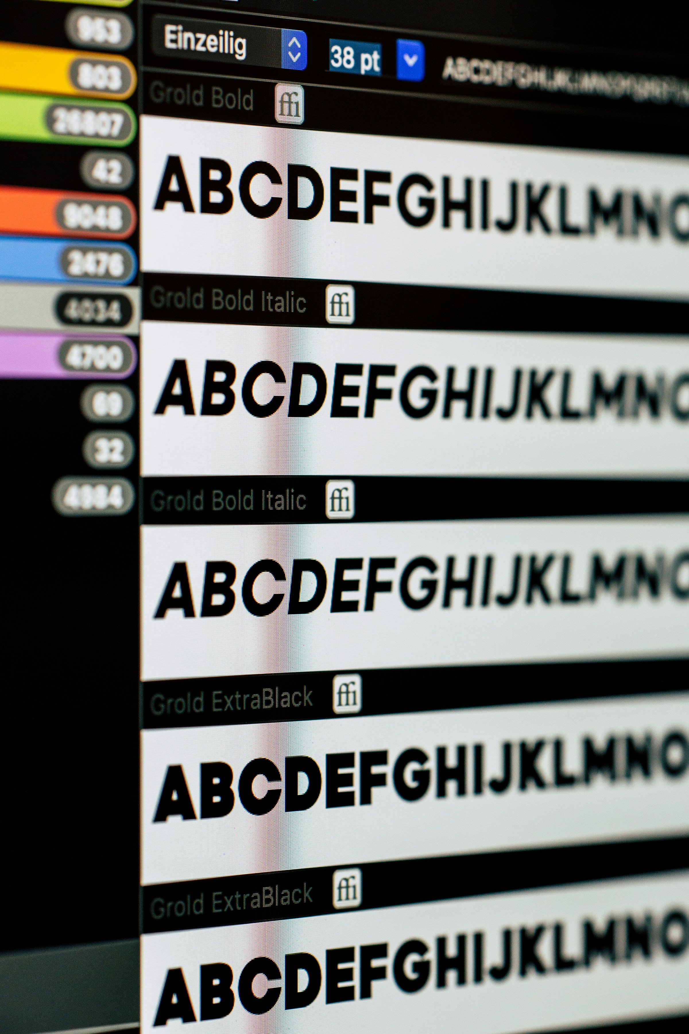
Best Font Categories for Billboard Design
-
Bold Sans-Serif Fonts (Top Choice)
Sans-serif fonts continue to dominate billboard advertising in 2026.
Why? They’re clean, modern, and highly legible at scale.
Top-performing examples include:
- Helvetica / Helvetica Neue
- Arial Black
- Gotham
- Futura
- Proxima Nova
- Montserrat
- Poppins
These fonts have strong and even strokes that maintain clarity while being viewed at a distance. They’re also especially effective for highway billboards where speed is high and legibility matters most.
-
Heavy Display Fonts (Use Strategically)
Thicker display fonts can add personality, but only if they remain readable.
Good billboard display fonts should:
- Avoid thin strokes
- Avoid excessive ornamentals
- Maintain wide letter spacing
Used correctly, display fonts can create memorability without sacrificing legibility.
-
Simple Serif Fonts (Limited Use)
Serif fonts can work in billboard design, but they require caution.
Thin serifs and high-contrast strokes often break down at a distance. If using serif fonts, stick with:
- Slab serif styles
- Heavier weights
- Minimal detailing
In most cases, sans-serif remains the safer and more effective choice for outdoor advertising.
Fonts to Avoid on Billboards
Some fonts look great on websites but fail outdoors.
Avoid:
- Script or cursive fonts
- Thin or light-weight fonts
- Highly decorative typefaces
- Compressed or narrow fonts
- Excessively stylized lettering
If someone has to sit there and think about what your billboard says, it’s already too late.
Go Big & Bold!
The best billboard fonts in 2026 are certainly not the most trendiest or aesthetic; they’re the clearest.
When choosing a typeface for your billboard ad, ask yourself:Can someone read this in 3 seconds from a moving vehicle?
If the answer is yes, you’re on the right track.