Common Billboard Design Mistakes
Billboards still remain one of the most powerful and visible forms of advertising in the marketing industry, but that’s only when they are designed correctly. Despite their monumental scale and ever present ability to be perceived, many billboard campaigns underperform for the simple reason of being designed with mistakes that prevent the message from being fully seen, understood, or remembered.
Out-of-home (OOH) advertising is viewed quickly and often at a distance, meaning small errors can have a big impact. Below are the most common billboard design mistakes advertisers are still making and exactly how you can fix them.
- Too Much Text / Wordiness
This is the most frequent and most costly mistake an advertiser can make.
Billboards, unlike novels and books, are not meant to explain. They are meant to impress and imprint a message on a given viewer or audience. When a design includes long sentences and wordiness, multiple bullet points and sections; or even detailed explanations, viewers simply don’t have the time to truly read it.
What works instead is:
- Short headlines (6-8 words max)
- One clear idea
- A call-to-action (CTA)
If someone can’t understand your message in a few seconds, then it won’t stick. If you stick to the aforementioned fixes, it is sure to be remembered.
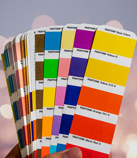
- Poor Color Choices
Designs that look good on computer screens don’t always translate to outdoor landscapes. Low contrast between text and background (i.e. light text on light imagery and dark text on dark imagery) can make billboards unreadable, especially when speed and bad lighting are involved.
What works instead:
- High contrast color combinations
- Simple color palettes
- Clear separations between text and imagery
Message legibility is top priority and oftentimes must be put before color and aesthetics in order to be truly successful.
- Small or Thin Fonts
Using thin or small font text is a fast way to lose legibility and impact on a billboard campaign. Billboards need to be readable from hundreds of feet away and in a way that allows the message to be quickly delivered.
What works instead:
- Large, bold typefaces
- Clean sans-serif fonts
- Strong visual hierarchy
If text is not readable at a glance, oftentimes the impact will be lackluster as a result.
Don’t Make The Same Mistakes!
Great billboard design is disciplined and has been studied and perfected by countless marketers and advertisers throughout the years. The most effective billboards aren’t the most complex or articulately designed, they’re the clearest.
Avoiding the aforementioned design mistakes can drastically improve your performance and skyrocket recall, overall campaign success, and return-on-investment (ROI).
When in doubt remember this sentence: Time is money, and seconds are all you have, be clear, clean, and concise, and success will find you.