What Makes Billboard Design Effective in 2026? 5 Tips That Actually Work
Billboards remain large and in charge but attention spans have gotten smaller. In 2026, effective billboard design isn’t about shoveling dense information onto an out-of-home (OOH) display, it’s about clarity and understanding how individuals actually experience this form of advertising in the real world.
Whether you’re designing billboards for a highway, a bustling urban shopping center, or for a dynamic digital billboard, the fundamentals remain vital but the execution has shifted.
Here are 5 billboard design tips that actually work in 2026; based on real viewer behavior.
- One Idea and One Message.
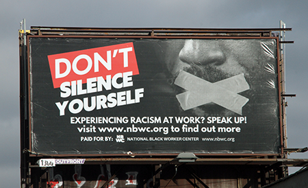
The most effective billboards in 2026 communicate a single idea, not a slew of shiny attributes or features of a product, service, or brand that hopes to convert viewers.
Drivers and pedestrians quite literally have seconds to view a message and to remember it, not minutes. If your billboard requires an explanation or time to digest it, it’s already failed in its mission.
Successful billboard designs answer one question within the first glance: What am I supposed to remember?
Anything other than that is visual noise.
- Fewer Words = Bigger Impact
Billboards are not 5, 10, or 20 page websites. They’re not even brochures, flyers, or business cards.
In 2026, billboards are about concise impact and that means:
- 6-8 words total
- One short headline
- A call to action (CTA)
- Optional brand name or logo
Short copy increases the speed at which a viewer can consume a message and recall it. This also keeps the message clear in unfortunate conditions like poor weather or low light.
- High Contract Is Key, Not Visual Appeal
Beautiful billboards are fantastic, but mostly a niece to have. Beauty does not equal effectiveness.
The best performing billboards prioritize high contrast over aesthetically chosen various colorful elements.
This means:
- Dark text on light backgrounds (or vice versa)
- Simple color palettes (2-3 colors maximum)
- Strong separation between text and imagery
If your billboard can’t be ready for a distance, or while on the move, then the design means almost nothing.
- Remember, Design Must Cater to Motion
Unfortunately for advertisers, viewers don’t often experience billboards while standing still. They see them:
- While driving
- While walking
- While stopped briefly in traffic
- While distracted
That means billboard designs must work quickly. To do this, avoid:
- Thin fonts
- Complex illustrations and visuals
- Busy background
- Microscopic logos
Bold shapes, large type, and clear visuals win every time in out=of-home ad design; especially in 2026.
- DOOH Shouldn’t Be Distracting
Digital out-of-home (DOOH) displays allow motion, rotation, and real-time updates. Nevertheless, going crazy on the dynamic features defeats the purpose; restraint is vital.
The most effective digital billboard designs:
- Use simple transitions
- Avoid fast animations
- Maintain consistent messaging across rotations
- Keep each frame readable
Wrapping It Up for 2026
Effective billboard design in 2026 isn’t about trends or clever tricks. It’s about respecting how people actually see outdoor advertising and designing to that accordingly.
If your billboard can be figured out in a glance and remembered on top of that, it’s doing exactly what it needs to. Keep it simple, bold, and clear and you’ll be in the clear too.